
Avoid These Bad Website Design Mistakes
- January 23, 2019
In this day and age of online digital marketing, a lot is riding on how your company presents itself online. Most typically, this is done through a website.
How your website is designed determines whether or not you’re going to be able to snag potential customers. Why?
People are very visual creatures and we retain things based on how we perceive them. To give you an idea, it takes about 10 seconds for a user to form an impression of your website. Yes, that’s a very limited window.
There are countless articles out there, listing how you can optimize your website to make viewers stay. However, we feel that it would be useful for us to provide some contrast.
Let’s say your business has a live website and you still don’t know why you’re not seeing the results that you hoped for. Then perhaps what you need to learn is how you can improve upon it.
This is what we’re trying to do with the list. In 2019, online marketing is no longer a cakewalk. It used to be, when there was a lot less competition around and the creative things you could do with your website were very limited.
Nowadays, the plethora of solutions and tips out there can get quite confusing. We’re here to narrow it down and list the things that you should avoid when building your company’s website.
The top worst website design mistakes that every business should steer clear of
What you aim to achieve with your company website is fairly straightforward. You want potential customers to know what you’re all about and to guide them throughout their conversion.
Since the 90s, website design is only becoming more involved, especially since almost every business has some form of an online presence.
With this kind of competition, more established companies make it a priority to have their websites designed for them to make sure that they’re constructed optimally.
It’s smart to invest in something as complicated as a website because this is essentially your virtual storefront.
You want to make is as inviting and intuitive as possible. So below, we’ve listed some things that could be holding you back from having a solid and foolproof site.
1. Your website is slow to show the customer what it’s all about and why it’s worth exploring.
Did you know that once you page loads, it takes about .05 seconds for a potential customer to decide whether it’s worth staying on it?
This is why you should lay things out them as soon as possible. Make sure that what your company is offering is easily discernible.
Don’t hide your assets. If you’ve garnered some awards or affiliations, show that off right on your main page.
It’s also important to highlight your products and services. Come right out with it. Your website has to scream, “This is who we are and this what we offer,” right on the main page. Otherwise, the average user won’t take the time to dig around for this sort of basic information.

2. Your website is not properly optimized for mobile devices.
We can’t stress enough how much this matters. These days, most internet users choose to stay connected through their smartphones or tablets rather than a desktop setup.
This means that your business has to be available where their target audience is. If this isn’t enough to convince you, we’re going to provide some hard stats.
- 48% of users won’t trust a company that has a website that hasn’t been optimized for their smartphones. They think that because the company didn’t bother to have this done, then this automatically means that they’re not serious and they don’t really care.
- 52% of users who have found a company’s website online and weren’t satisfied with the experience say that they’re not likely to revisit it again, let alone purchase anything.
- 91% of users think that speed is a prerequisite. If the website doesn’t load fast enough on their mobile device or they’re having a hard time navigating through it, then they would automatically opt out.
- 50% of users will choose some other company if the initial company that they thought of doesn’t have a site that is mobile friendly.
- 61% of users will choose some other company if the information that they were looking for is not readily available.
Convinced? Not having a website optimized for mobile devices could be why you’re even driving potential customers to your competition. You have to correct this mistake as soon as possible.
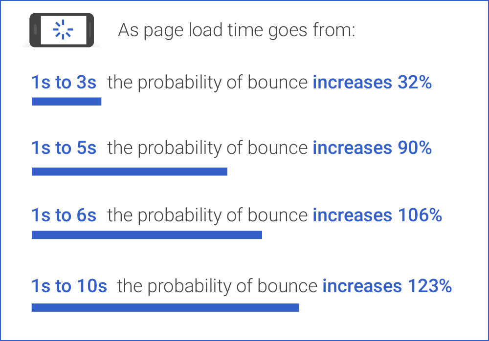
3. Your website doesn’t load in less than three seconds
Now that we’re on the subject of convenience, the reason why the digital marketplace is so popular is because people can’t be bothered to leave their homes and go to physical stores anymore.
These days, it’s all about who can provide you the right products in the shortest amount of time possible. Waiting has now become a thing of the past.
So, how can you expect to drive in more customers if your website fails to provide them with that kind of efficiency right off the bat?
We’re talking about fast here. According to online users, 47% of them need to a page to load in no more than 2 seconds. If you fail to provide that, then it’s adios.
4. Your website has the wrong font size.
This is a no-brainer. We’re encountered this multiple times from websites that are trying to go for something hip and ultra-minimal. What the company fails to realize is that efficiency trumps aesthetics.
One of the most common mistakes that web designers make is that they make font sizes too small. You can’t expect potential customers to just squint and endure poor website design when there are many other websites who will provide them with a better experience.
Ask you web designer to select fonts that will be compatible across all devices (honestly, we’re surprised that you would even have to ask). The reason why this mistake is so often made is that some web designers tend to focus on the desktop version of the site.
While it might look great on a big hi-res monitor, that usually doesn’t translate very well on smaller screens.
Your best bet should be a font size that is 14px or higher.
5. Your website has pages that open through new browser windows.
If all your links open through new browser windows, then this makes for a very congested online experience. Not only will this give the user a more difficult time navigating through your site, this eats up a lot of bandwidth.
It’s also important to give the user the option to return to the previous pages that they were on.
6. Your website has social media icons right at the top.
It’s smart to expand and branch out through other social media platforms. And of course, it’s important that you have links for these on your website.
However, you have to place them in the proper position. Never put them at the top and don’t let them be the first thing that the user sees.
For good measure, place them at the bottom. Why? You don’t want the user to be distracted away from your site. You’ve gotten them there. Now, do your best to keep them.
![]()
7. Your website doesn’t have an intuitive navigation panel.
A good way to come outright with what users can view on your site is to have a simple navigation panel. Right off the bat, this shows the extent of your entire website.
If your website hides certain pages or has confusing picture or icon links, then that would be the equivalent of a meandering salesperson who doesn’t really know what they’re talking about.
8. Your website has tiny links and buttons that are hard to click.
With ease of use in mind, you don’t want it to be a dart game every time your user wants to check out a page on your site.
On a desktop, these buttons might be easy to click with a mouse pointer. But on a phone? They might be too small for human fingers.
9. Your website doesn’t have headings and is too text-heavy.
Nowadays, it’s all about the skimming. Your potential customers will be turned off if you all you present them with are walls of text.
And even if the text is reasonably spaced out, perhaps sections are not easily distinguishable because you don’t use H1 or H2 headings.
More importantly, if you don’t use headings, you’re less visible to search engines. Headings are a perfect way to use optimized keywords that users are searching for online.
Search engines like Google use complex algorithms to scan websites in order to determine where they rank in search engine results pages.
If nothing about your text stands out, this makes it more difficult for their bots to know what your website is about, making your site more likely to be ignored.
While we’re on the subject of the content on your site, maybe the reason why it’s not getting much traffic is that the content is not that attractive to begin with.
Another common mistake that companies make when they build their website is that they include photos or videos.
Since we’ve covered that people are visual creatures, then it follows that they’re more likely to find your website more engaging if there is something to look at or watch.
This isn’t the only upside to high quality images and video content. It’s easier to unload information through these methods as well.
A typical blog post can be summarized in 5-minute video or one even shorter than that.
10. Your website does not have contact information on prime site real estate.
The whole point of having a website is to convert traffic to sales. How do you expect to this if you make it hard for customers to contact you?
Your customers should have your contact information handy not only to rake in sales, but for you to answer any queries they might have. Most of the time, all it takes is a couple of answered questions to drive in a sale.
Your best option: hire a professional web design team who knows what they’re doing
We understand that most of this stuff can be a pain to stay on top off. We’re also pretty sure that you don’t want to waste time troubleshooting with a freelance web designer who doesn’t really care about your business anyway.
Your online image is a big deal and your business should entrust it to a team who will make it their business to build it up. This is where we come in. Contact us today, so we can make your website the well-oiled machine that it should be.
MARKETING CONSULTATION
One of our experts is online, she will get back to you

Tanya Mendes
Marketing Manager